
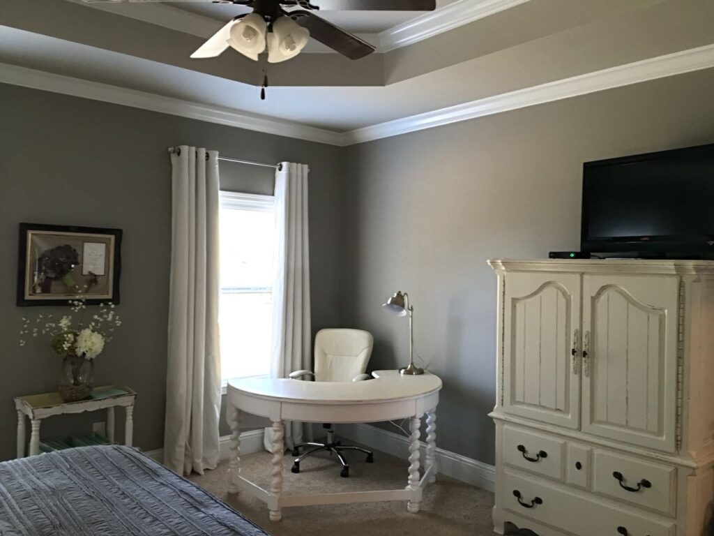
Blog

  • Benjamin Moore White: Timeless Elegance and Versatility

    Benjamin Moore White: Timeless Elegance and Versatility

    Introduction:

    Benjamin Moore, a renowned name in the world of interior paints, offers a wide range of colors to suit every taste and style. Among their vast collection, Benjamin Moore White stands out as a versatile and timeless choice. In this article, we will explore the characteristics, popular shades, and creative applications of Benjamin Moore White, highlighting its ability to transform any space with its understated elegance.

    • The Allure of Benjamin Moore White:

    White has long been associated with purity, simplicity, and sophistication. Benjamin Moore White captures these qualities effortlessly, making it a favorite among homeowners, interior designers, and professionals. Its ability to create a sense of openness and light in any room makes it a go-to option for both traditional and contemporary spaces.

    • Popular Shades of Benjamin Moore White:

    a. Decorator’s White: This crisp and clean white with a slight cool undertone is a classic choice. It provides a fresh and airy feel to any room, making it a popular pick for walls, trims, and ceilings.

    b. Simply White: As the name suggests, this shade is the epitome of simplicity and elegance. Its warm undertones create a welcoming atmosphere and make it an excellent choice for both traditional and modern interiors.

    c. Chantilly Lace: If you’re looking for a pure, bright white, Chantilly Lace is the answer. Its cool undertones make it a versatile option that pairs well with a wide range of colors and materials.

    d. White Dove: Known for its softness and warmth, White Dove exudes a sense of coziness and tranquility. It works beautifully in spaces where a touch of warmth is desired, such as bedrooms and living rooms.

    • Applications and Combinations:

    a. Creating Serene Bedrooms: Benjamin Moore White, in its various shades, provides a serene backdrop for bedrooms. Whether used on walls, bedding, or furniture, it sets a calming tone and allows other elements, such as artwork or accent pieces, to shine.

    b. Accentuating Architectural Features: White is an excellent choice for highlighting architectural details, such as crown moldings, wainscoting, or window frames. Benjamin Moore White enhances these features, creating a subtle contrast and adding depth to the space.

    c. Modern Minimalism: Benjamin Moore White is the cornerstone of minimalist design. Its clean lines and uncluttered aesthetic create a sense of harmony and balance, making it ideal for contemporary spaces. Pair it with sleek furniture and minimal decor for a sophisticated look.

    d. Artistic Expression: Artists and creative individuals often turn to Benjamin Moore White as the backdrop for their work. Its neutral canvas allows artwork, sculptures, and installations to take center stage, accentuating their colors and textures.

    • Tips for Choosing the Right White:

      a. Consider Lighting: Natural and artificial lighting can significantly impact the appearance of white paint. Test samples in different lighting conditions to find the perfect shade for your space.

      b. Undertones: Whites can have cool, warm, or neutral undertones. Consider the existing colors and materials in your room to choose a white with the appropriate undertone that complements the overall aesthetic.

      c. Sample and Compare: Painting small swatches on your walls and observing them at different times of the day can help you make an informed decision. Compare the shades against your furniture, fabrics, and decor to ensure they harmonize well.

      Conclusion:

      Benjamin Moore White is a timeless choice that effortlessly adds elegance and versatility to any space. With its various shades and applications, it provides a clean, fresh canvas that can be personalized to suit any interior style. Whether you prefer a classic, modern, or artistic look, Benjamin Moore White is sure to transform your space into a haven of understated beauty.

    1. Top Tips for Damp Problems

      Top Tips for Damp Problems

      Dealing with damp problems may be a worrying and challenging chore for homeowners. In addition to harming how your possessions look, dampness can cause structural glitches and present health dangers. Damp proofing is an excellent way to agree with damp problems. This post will define damp proofing and offer objective advice for dealing with damp issues.

      Understanding What Damp Proofing Is: Top Tips for Damp Problems

      Damp proofing is a method used to stop or manage to build moisture levels, ensuring that water does not seep into the framework or build up inside the rooms. Moreover, it involves several techniques and things like dampproof membranes, coatings, and ventilation classifications that make a barrier against moisture.

      Here are some of the top-class tips to help you understand and address damp problems:

      Recognize the source of dampness: Before putting any moisture-proofing measures in place, it is vital to recognize the cause of the wetness. Some familiar sources include leaky pipes, damaged gutters, condensation, rising dampness from the ground, or penetrating dampness from outside sources like precipitation. You can select the best solution by determining the root cause.

      Know the kinds of damp: Understanding the many types of moisture will help you choose the best damp proofing technique. Penetrating dampness enters the building through fractures, gaps, or poor seals. In contrast, rising dampness occurs when moisture from the ground travels up through porous materials. On the other hand, condensation results from high air humidity condensing on more excellent surfaces.

      Ensure appropriate ventilation: Reducing humidity and preventing condensation depend on proper ventilation. Ensure extractor fans or windows that can be opened to let in the fresh and cool air are present in kitchens, bathrooms, and other places susceptible to dampness. To further reduce humidity indoors, utilize dehumidifiers or moisture-absorbing items.

      Maintain gutters and downspouts: Gutter and downspout maintenance are essential because clogged or damaged gutters and downspouts can allow water to leak into the building, resulting in dampness issues. Inspect and clean frequently to ensure your gutters are clear of obstructions and operating correctly. Quickly fix any cracks or leaks to prevent water from entering the building.

      Fix leaks promptly: When you notice a leak, fix it immediately since unmanaged water leaks from windows, roofs, or pipes can lead to severe damage. Check your home frequently for leaky indicators like water stains, wet spots, or musty odors. Leaks should be repaired as a way to avoid more moisture-related issues.

      Use damp proofing treatments: Depending on the kind and extent of the damp issue, you might need to do so. These can involve coating basements, floors, or walls with dampproof membranes or coatings to stop water from penetrating. Consult a qualified damp specialist to decide the best action for your circumstance. You should know the actual understanding of what damp proofing is.

      Maintain proper insulation: Insulation effectively helps avoid condensation by preventing chilly surfaces. Ensure your home is insulated, especially in wet places like basements and crawl spaces. Insulating walls, floors, and roofs will improve energy efficiency while lowering the likelihood of developing mold issues.

      Consult a specialist: If you need clarification on the origin or extent of your damp problem, it’s a fine idea to consult an expert or a professional.. Specialists in dampness can evaluate the condition, determine the underlying cause, and suggest the best damp proofing measures. They have the sound knowledge and expertise to tackle damp problems and guarantee a lasting fix.

      You can effectively tackle damp issues by having a clear understanding what damp proofing is and putting the appropriate tactics into practice. You may prevent dampness from harming your property by locating the source, preserving appropriate ventilation, responding quickly to leaks, and getting professional guidance when necessary. Also, you can Tapco Home Dry for the excellent services as we have a very professional and expert staff to help you out.

    2. The Timeless Charm of Dorian Gray Sherwin Williams

      The Timeless Charm of Dorian Gray Sherwin Williams

      Introduction:

      When it comes to interior design, selecting the perfect paint color can significantly impact the overall aesthetic of a space. Sherwin-Williams, a renowned paint manufacturer, offers a wide range of captivating hues. Among their impressive collection, Dorian Gray stands out as a timeless and versatile shade. In this article, we will explore the captivating qualities of Dorian Gray by Sherwin-Williams, its color characteristics, and its potential applications in creating beautiful interiors.

      Dorian Gray: A Color Profile:

      Dorian Gray, as the name suggests, draws inspiration from Oscar Wilde’s famous novel, “The Picture of Dorian Gray.” This paint color embodies the essence of timeless elegance, sophistication, and understated beauty. It falls within the family of warm grays, with subtle undertones that shift between cool and warm depending on the lighting and surrounding elements.

      Color Characteristics:

      Dorian Gray exhibits a medium to dark gray hue with balanced undertones. Its versatility lies in its ability to adapt to various lighting conditions, appearing different throughout the day. Under natural daylight, Dorian Gray displays a cooler tone, accentuating its timeless elegance. However, when illuminated with warm artificial light, it reveals warmer undertones, imparting a cozy and inviting atmosphere.

      Pairing Possibilities:

      One of the remarkable qualities of Dorian Gray is its compatibility with a wide range of color schemes and design styles. Its neutral base allows it to seamlessly blend with both warm and cool tones, making it an ideal backdrop for various interior design elements.

      1. Modern Minimalism: Dorian Gray can serve as a perfect canvas for sleek and contemporary spaces. Pair it with crisp white accents and minimalist furniture to create a clean and sophisticated atmosphere.
      2. Warm and Cozy: Combine Dorian Gray with warm earthy tones like terracotta, deep browns, or rich oranges to create a cozy and inviting ambiance in living rooms or bedrooms.
      3. Timeless Elegance: For a classic and timeless look, pair Dorian Gray with shades of white, ivory, or soft pastels. This combination creates a harmonious and refined environment.
      4. Dramatic Contrast: Embrace boldness by using Dorian Gray as a backdrop for vibrant pops of color. Whether it’s vibrant artwork, statement furniture, or bold accessories, the contrast with Dorian Gray adds a touch of drama to any room.

      Versatility in Spaces:

      Dorian Gray’s adaptability makes it suitable for various spaces, from residential to commercial environments.

      1. Living Areas: In living rooms or family spaces, Dorian Gray provides a neutral yet sophisticated backdrop that allows other design elements to shine. It creates a calming atmosphere that encourages relaxation and socialization.
      2. Bedrooms: Dorian Gray promotes a serene and tranquil ambiance in bedrooms. Pair it with soft textiles, luxurious bedding, and gentle lighting to create a soothing retreat.
      3. Offices and Workspaces: Dorian Gray adds an air of professionalism and sophistication to offices and workspaces. It provides a neutral and calming environment that promotes focus and productivity.
      4. Retail and Hospitality: The timeless elegance of Dorian Gray makes it an excellent choice for commercial spaces such as retail stores, hotels, and restaurants. It creates a welcoming and refined atmosphere that appeals to a wide range of customers.

      Conclusion:

      Dorian Gray Sherwin Williams offers a versatile and timeless color option that brings sophistication and elegance to any interior space. Its medium to dark gray hue, combined with shifting undertones, provides a neutral yet captivating backdrop for various design styles. Whether used in residential or commercial settings, Dorian Gray’s adaptability and compatibility with different color schemes make it a popular choice among interior designers and homeowners seeking to create stylish and inviting spaces. So, consider Dorian

    3. Unveiling the Dimensions: How Thick is Drywall?

      Unveiling the Dimensions: How Thick is Drywall?

      Introduction:

      Drywall, also known as gypsum board or plasterboard, is a ubiquitous material used in the construction industry for creating interior walls and ceilings. Its versatility, ease of installation, and fire-resistant properties have made it a popular choice for residential and commercial projects. In this article, we will explore the various dimensions of drywall, focusing on its thickness and how it affects its applications.
      Understanding Drywall:

      Drywall is composed of a core made from gypsum, a naturally occurring mineral, sandwiched between two layers of paper or fiberglass. This composition lends drywall its strength, rigidity, and fire-resistant properties. It is available in different sizes and thicknesses to accommodate various construction needs.

      Standard Drywall Thickness:

      The most commonly used drywall thickness for interior walls is 1/2 inch (12.7 mm). This thickness provides adequate strength and durability for regular wall applications. It is suitable for most residential and commercial projects where walls are not subjected to excessive wear and tear or specific structural requirements.

      Thicker Drywall Options:

      In certain situations where added strength or enhanced soundproofing is desired, thicker drywall options are available. The next standard thickness is 5/8 inch (15.9 mm). This thicker variant is often used in areas where impact resistance is important, such as hallways, stairwells, and shared walls between units in multi-family buildings.

      Fire-Resistant Drywall:

      Fire-resistant drywall, also known as Type X drywall, is designed to provide enhanced fire protection. It has a gypsum core that contains special additives, making it more resistant to fire and heat. Standard fire-resistant drywall typically has a thickness of 5/8 inch (15.9 mm). However, specialized fire-rated drywall can have even greater thicknesses, such as 3/4 inch (19.1 mm) or 1 inch (25.4 mm), depending on the level of fire protection required.

      Specialty Drywall:

      Aside from the standard thickness options, specialty drywall is available to meet specific construction needs. This includes moisture-resistant drywall for areas prone to high humidity, such as bathrooms or basements, as well as impact-resistant drywall designed to withstand greater force. These specialty variants can have varying thicknesses based on their intended use and the manufacturer’s specifications.

      Considerations and Applications:

      The choice of drywall thickness depends on several factors, including the intended use of the wall or ceiling, local building codes, and specific construction requirements. Thinner drywall is generally suitable for standard interior walls in residential and commercial buildings, while thicker options provide added strength and resistance in areas prone to impacts or requiring enhanced fire protection.

      It is important to note that thicker drywall may also affect other aspects of construction, such as door and window frame sizes, as well as the need for additional framing or support. Consulting with a professional contractor or builder is advisable to ensure the appropriate thickness and construction techniques are employed for specific project requirements.

      Conclusion:

      how thick is drywall: Drywall, a staple material in the construction industry, comes in various thicknesses to accommodate different applications. From the standard 1/2 inch thickness for regular walls to thicker options for increased durability, impact resistance, or fire protection, the dimensions of drywall are carefully chosen to meet specific construction needs. Understanding the appropriate thickness for different areas within a building is crucial to ensure the structural integrity and safety of the overall project. So, the next time you encounter drywall, you can appreciate the thought and consideration given to its thickness to meet the demands of modern construction.

    4. What Color is Pewter? Unraveling the Enigma of a Unique Metallic Hue

      What Color is Pewter? Unraveling the Enigma of a Unique Metallic Hue

      Introduction:

      Pewter, a fascinating alloy that has captivated human civilizations for centuries, is known for its distinct color and versatile applications. Despite its widespread use and popularity, many individuals remain unsure about the precise color of pewter. In this article, we will delve into the world of pewter, examining its composition, historical significance, and, most importantly, its color.

      Understanding Pewter:

      Pewter is an alloy primarily composed of tin, with trace amounts of other metals such as copper, antimony, and bismuth. This combination of elements gives pewter its unique characteristics, including its softness, malleability, and low melting point. While the exact composition can vary depending on the manufacturer and intended purpose, pewter generally contains a significant proportion of tin.

      Historical Significance:

      Pewter has a rich history that dates back thousands of years. It was widely used in ancient civilizations such as the Egyptians, Romans, and Greeks, who crafted exquisite vessels, figurines, and ornaments from this versatile metal. Throughout the Middle Ages, pewter became a staple material for tableware, including plates, cups, and cutlery, due to its affordability and ease of production.

      Exploring the Color Spectrum:

      The color of pewter can be described as a subtle, muted gray with a warm undertone. It falls somewhere between the shades of silver and dark gray, displaying a depth and richness that makes it instantly recognizable. The specific hue of pewter can vary depending on factors such as the alloy’s composition, the finishing techniques employed, and even the lighting conditions in which it is observed.

      Lighting and Pewter’s Color:

      The appearance of pewter can be influenced by the lighting conditions in which it is observed. In natural daylight, pewter tends to exhibit a silvery-gray tone with hints of warmth. Under artificial lighting, such as incandescent or warm LED lights, the warm undertones are enhanced, giving pewter a golden-gray appearance. In contrast, cooler lighting sources, such as fluorescent or cool LED lights, may emphasize the cooler gray tones in pewter.

      Patina and Aging Effects:

      Over time, pewter develops a natural patina, which is a thin layer that forms on the surface due to oxidation. This patina can alter the color of pewter, adding subtle shades of green, blue, or brown. While some individuals appreciate the aged appearance of patinated pewter, others prefer the original color and may choose to polish their pewter items to restore their lustrous gray hue.

      Versatility and Modern Applications:

      Pewter’s unique color and properties make it a sought-after material for various modern applications. It is commonly used in jewelry-making, where its subdued gray tone complements a wide range of gemstones and other metals. Additionally, pewter finds its way into contemporary home decor, kitchenware, and even architectural accents, adding a touch of elegance and sophistication.

      Conclusion:

      what color is pewter: Pewter, with its distinctive gray color and historical significance, continues to captivate the imagination of people worldwide. The alloy’s muted gray hue, enhanced by warm undertones, renders it instantly recognizable and versatile. Whether adorning ancient artifacts or modern-day jewelry, pewter’s unique color provides a timeless appeal. So, the next time you encounter a piece of pewter, take a moment to appreciate the captivating color that has fascinated civilizations throughout the ages.

    5. Repose Grey: The Perfect Balance of Serenity and Sophistication

      Repose Grey: The Perfect Balance of Serenity and Sophistication

      Introduction:

      When it comes to selecting a paint color that creates a serene and sophisticated ambiance, Repose Grey by Sherwin-Williams is a top contender. This versatile shade of gray has gained popularity among homeowners and interior designers for its ability to bring a sense of calm and elegance to any space. In this article, we will explore the allure of Repose Grey, uncovering its unique qualities and explaining why it has become a go-to choice for those seeking a refined and versatile color palette.
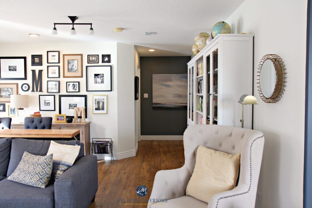
      Read Also: Interior Painting

      The Allure of Repose Grey:

      1. Serenity and Tranquility:

      Repose Grey offers a soothing and tranquil atmosphere that instantly transforms a space into a peaceful retreat. This shade of gray has subtle undertones of beige and taupe, creating a calming effect that promotes relaxation and serenity. Whether used in bedrooms, bathrooms, or living areas, Repose Grey envelops the room in a sense of tranquility, making it an ideal choice for those seeking a peaceful sanctuary within their home.

      1. Versatility:

      One of the most remarkable qualities of Repose Grey is its versatility. This neutral gray hue adapts effortlessly to various design styles and color schemes. It serves as a perfect backdrop for both warm and cool color palettes, making it an excellent choice for those seeking a flexible and adaptable color palette. Repose Grey harmonizes beautifully with other design elements, allowing you to create a cohesive and balanced look.

      1. Timeless Elegance:

      Repose Grey exudes a timeless elegance that transcends passing design trends. Its classic and understated beauty ensures that it remains relevant and sophisticated for years to come. Whether used on walls, trim, or cabinetry, Repose Grey provides a timeless backdrop that allows for easy updates and modifications to your space. Its enduring appeal makes it a popular choice for those seeking a long-lasting and elegant aesthetic.

      1. Light Reflectivity:

      Repose Grey possesses excellent light-reflective properties, enhancing the natural and artificial light in a room. This quality helps to brighten up the space, creating a more open and airy feel. Repose Grey reflects light, adding a subtle glow that makes the room appear more spacious and vibrant. It brings a sense of freshness and vitality, making the space feel more inviting and energized.

      1. Pairing Possibilities:

      The neutral nature of Repose Grey offers endless pairing possibilities with various colors and finishes. It pairs beautifully with both warm and cool neutrals, creating a balanced and harmonious look. For a monochromatic scheme, it can be paired with other shades of gray and beige, creating depth and dimension. Alternatively, it can be paired with bolder colors to create a striking contrast and focal point. Repose Grey allows for creativity and personalization, making it adaptable to various design preferences.

      Conclusion:

      Repose Grey by Sherwin-Williams is a versatile and sophisticated shade of gray that brings serenity and elegance to any space. Its serenity and tranquility, versatility, timeless elegance, light-reflective properties, and pairing possibilities make it a favorite among homeowners and interior designers. Whether used in bedrooms, living rooms, or dining areas, Repose Grey creates a refined and calming atmosphere that stands the test of time. Embrace the serenity and sophistication of Repose Grey and transform your space into a haven of tranquility and timeless beauty.

    6. Sherwin Williams Creamy: Embracing the Warmth of a Soft Neutral

      Sherwin Williams Creamy: Embracing the Warmth of a Soft Neutral

      Introduction:

      When it comes to selecting a paint color that exudes warmth and versatility, Sherwin-Williams Creamy is a top choice. This soft neutral shade has gained popularity among homeowners and interior designers for its ability to create a welcoming and inviting atmosphere. In this article, we will explore the allure of Sherwin-Williams Creamy, uncovering its unique qualities and explaining why it has become a go-to choice for those seeking a warm and versatile color palette.

      The Allure of Sherwin-Williams Creamy:

      1. Warmth and Comfort:

      Sherwin-Williams Creamy offers a warm and comforting ambiance that instantly transforms a space into a cozy retreat. With its warm undertones, this soft neutral shade creates a soothing and inviting atmosphere, making it ideal for bedrooms, living rooms, and other areas where relaxation is desired. The warmth of Sherwin-Williams Creamy envelops a room, providing a sense of comfort and serenity.

      1. Versatility:

      One of the remarkable qualities of Sherwin-Williams Creamy is its versatility. This soft neutral shade seamlessly blends with various design styles and color palettes. It serves as a neutral backdrop that complements both warm and cool color schemes, making it an excellent choice for those seeking a versatile and adaptable color palette. Sherwin-Williams Creamy harmonizes effortlessly with other design elements, allowing you to create a cohesive and balanced look.

      1. Light Reflectivity:

      Sherwin-Williams Creamy possesses excellent light-reflective properties, enhancing the natural and artificial light in a room. This quality helps to brighten up the space, creating a more open and airy feel. Sherwin-Williams Creamy reflects light, adding a subtle glow that makes the room appear more spacious and vibrant. It brings a sense of freshness and vitality, making the space feel more inviting and energized.

      1. Tranquil Simplicity:

      Sherwin-Williams Creamy embodies a tranquil simplicity that creates a serene and uncluttered atmosphere. It provides a clean and soft backdrop that allows other design elements to shine. Whether used on walls, trim, or cabinetry, Sherwin-Williams Creamy creates a sense of harmony and balance. Its simplicity allows for easy coordination with furniture, textiles, and accessories, making it an excellent choice for those seeking a cohesive and timeless aesthetic.

      1. Pairing Possibilities:

      The neutral nature of Sherwin-Williams Creamy offers endless pairing possibilities with various colors and finishes. It pairs beautifully with both warm and cool neutrals, creating a balanced and harmonious look. For a monochromatic scheme, it can be paired with other shades of cream and beige, creating depth and dimension. Alternatively, it can be paired with bolder colors to create a striking contrast and focal point. Sherwin-Williams Creamy allows for creativity and personalization, making it adaptable to various design preferences.

      Conclusion:

      Sherwin Williams Creamy is a warm and versatile soft neutral shade that brings comfort and elegance to any space. Its warmth and versatility, light-reflective properties, tranquil simplicity, and pairing possibilities make it a favorite among homeowners and interior designers. Whether used in bedrooms, living rooms, or dining areas, Sherwin-Williams Creamy creates a welcoming and inviting atmosphere that embraces the beauty of simplicity. Embrace the warmth and versatility of Sherwin-Williams Creamy and transform your space into a haven of cozy elegance and timeless appeal.

    7. Balboa Mist: The Timeless Elegance of a Subtle Gray

      Balboa Mist: The Timeless Elegance of a Subtle Gray

      Introduction:

      When it comes to choosing a paint color that exudes sophistication and versatility, Balboa Mist by Benjamin Moore is a top contender. This soft and subtle gray has gained popularity among homeowners and designers for its ability to create a timeless and elegant look. In this article, we will explore the allure of Balboa Mist, uncovering its unique qualities and explaining why it has become a go-to choice for those seeking a refined and neutral color palette.

      The Allure of Balboa Mist:

      1. Subtle Sophistication:

      Balboa Mist offers a sophisticated and understated elegance that instantly elevates any space. Its soft gray undertones create a calming and serene atmosphere, making it an excellent choice for bedrooms, living rooms, and other gathering areas. Unlike bolder grays, Balboa Mist exudes a subtle charm that complements a wide range of design styles, from traditional to contemporary.

      1. Versatility:

      One of the most remarkable qualities of Balboa Mist is its versatility. This neutral gray hue effortlessly blends with various color palettes and design elements. It serves as a beautiful backdrop for both warm and cool color schemes, making it an ideal choice for those seeking a flexible and adaptable color palette. Balboa Mist acts as a blank canvas, allowing you to showcase other design elements while maintaining a cohesive and harmonious look.

      1. Timeless Appeal:

      Balboa Mist boasts a timeless appeal that transcends passing design trends. Its classic and understated beauty ensures that it remains relevant and elegant for years to come. Whether used on walls, trim, or cabinetry, Balboa Mist provides a timeless backdrop that allows for easy updates and modifications to your space. Its enduring allure makes it a popular choice for those seeking a long-lasting and sophisticated aesthetic.

      1. Light Reflectivity:

      Balboa Mist possesses excellent light-reflective properties, enhancing the natural and artificial light in a room. This quality helps to create a brighter and more open feel, making it particularly advantageous for spaces with limited natural light or smaller rooms. Balboa Mist has the ability to transform a space by infusing it with a refreshing and airy ambiance, making it appear more spacious and inviting.

      1. Pairing Possibilities:

      The neutral nature of Balboa Mist allows for endless pairing possibilities with various colors and finishes. It harmonizes beautifully with both warm and cool neutrals, creating a balanced and inviting space. For a monochromatic look, it can be paired with other shades of gray, creating depth and dimension. Alternatively, it can be paired with bolder colors to create a striking contrast and focal point. Balboa Mist offers versatility and allows for personalization and customization according to your design preferences.

      Conclusion:

      Balboa Mist by Benjamin Moore is a timeless and versatile shade of gray that brings subtle elegance to any space. Its subtle sophistication, versatility, timeless appeal, light-reflective properties, and pairing possibilities make it a favorite among homeowners and designers alike. Whether used in bedrooms, living rooms, or kitchens, Balboa Mist creates a serene and refined atmosphere that stands the test of time. Embrace the timeless elegance of Balboa Mist and transform your space into a haven of understated beauty and sophistication.

    8. Embracing the Sun: Exploring the Radiant Yellow Color Palette

      Embracing the Sun: Exploring the Radiant Yellow Color Palette

      Introduction:

      When it comes to adding vibrancy and cheerfulness to any space, few colors can rival the radiance of yellow. The yellow color palette offers a wide range of shades, from soft and subtle to bold and vibrant, allowing for endless possibilities in design and decor. In this article, we will delve into the allure of the yellow color palette, uncovering its unique qualities and explaining why it has become a popular choice for those seeking a bright and uplifting ambiance.

      The Allure of the Yellow Color Palette:

      1. Energy and Positivity:

      Yellow is often associated with energy and positivity. It exudes a sense of happiness and optimism, making it an excellent choice for creating a vibrant and uplifting environment. Whether used as a main color or as an accent, the yellow color palette infuses a space with a burst of energy and adds a touch of sunshine to even the dullest corners. It’s the perfect choice for spaces where you want to create a lively and inviting atmosphere.

      1. Versatility:

      The yellow color palette offers a wide range of shades, each with its own unique personality. From soft pastels to bold citrus tones, there is a yellow shade to suit every design style and preference. Soft yellows can create a calm and serene ambiance, while brighter yellows bring a sense of vibrancy and excitement. The versatility of the yellow color palette allows you to tailor the intensity and mood of a space to your liking.

      1. Creativity and Inspiration:

      Yellow is often associated with creativity and inspiration. It stimulates the mind and encourages new ideas and innovative thinking. Incorporating yellow into your space can spark creativity and provide a fresh perspective. Whether used in an office, a creative studio, or a children’s playroom, the yellow color palette sets the stage for imagination and innovation to flourish.

      1. Warmth and Coziness:

      Yellow hues have a natural warmth that creates a cozy and inviting atmosphere. From soft buttery yellows to rich ochre tones, yellow adds a touch of warmth and comfort to any space. It can make a room feel more intimate and welcoming, particularly in areas like living rooms, dining rooms, and bedrooms. The yellow color palette embraces a sense of home and creates a cozy haven for relaxation and gathering.

      1. Complementary Pairings:

      Yellow pairs exceptionally well with various colors, allowing for endless pairing possibilities. It harmonizes beautifully with neutrals like whites, grays, and beiges, creating a balanced and elegant look. For a bold and vibrant aesthetic, yellow can be paired with contrasting colors like blues or purples to create a captivating and dynamic contrast. The yellow color palette offers the opportunity to play with different combinations and create a truly personalized and unique space.

      Conclusion:

      The yellow color palette brings energy, positivity, and warmth to any space it graces. Its versatility, ability to inspire creativity, and range of shades make it a popular choice for homeowners and designers alike. Whether used in soft and subtle pastels or bold and vibrant hues, yellow adds a touch of radiance and joy to any room. Embrace the sun-kissed beauty of the yellow color palette and transform your space into a haven of vibrant energy and warmth.

    9. Agreeable Gray Paint: The Perfect Blend of Warmth and Neutrality

      Agreeable Gray Paint: The Perfect Blend of Warmth and Neutrality

      Introduction:

      When it comes to selecting a paint color that effortlessly blends with various design styles and provides a warm and inviting atmosphere, Agreeable Gray is a top contender. This versatile shade by Sherwin-Williams has gained popularity among homeowners and interior designers for its ability to create a harmonious and balanced look. In this article, we will explore the allure of Agreeable Gray paint, uncovering its unique qualities and explaining why it has become a go-to choice for those seeking a welcoming and versatile color palette.

      The Allure of Agreeable Gray Paint:

      1. Warmth and Neutrality:

      Agreeable Gray strikes the perfect balance between warmth and neutrality. As a warm gray with beige undertones, it offers a comforting and inviting ambiance to any space. Unlike cooler grays, which can sometimes feel stark, Agreeable Gray exudes a sense of warmth and coziness. This makes it an excellent choice for creating a welcoming environment in living rooms, bedrooms, and other gathering areas.

      1. Versatility:

      One of the most remarkable qualities of Agreeable Gray is its versatility. This shade adapts effortlessly to various design styles, from traditional to contemporary. Whether your aesthetic leans towards farmhouse, coastal, or minimalist, Agreeable Gray serves as a reliable and adaptable backdrop. It complements both warm and cool color schemes, making it an ideal choice for those seeking a versatile and timeless palette.

      1. Light Reflectivity:

      Agreeable Gray possesses excellent light-reflective properties, which can help brighten up a space. Its ability to reflect light enhances natural and artificial lighting, creating a more open and airy feel. This quality is particularly advantageous in rooms with limited natural light or smaller spaces where a sense of spaciousness is desired. Agreeable Gray adds a touch of brightness and vitality to any room it graces.

      1. Pairing Possibilities:

      The neutral nature of Agreeable Gray allows it to pair seamlessly with various colors and finishes. It serves as a versatile canvas that enhances both bold and subtle accent hues. For a classic and sophisticated look, it pairs exceptionally well with crisp whites and deep grays. If you prefer a more vibrant aesthetic, it can be paired with jewel tones or pops of bold color to create a captivating contrast. Agreeable Gray offers endless possibilities for personalization and customization.

      1. Timeless Appeal:

      Agreeable Gray has proven its staying power in the design world, remaining a popular choice for many years. Its timeless appeal stems from its ability to blend with various styles and withstand changing design trends. It provides a neutral foundation that can easily adapt to different design elements and accessories. By choosing Agreeable Gray, you can create a space that stands the test of time, ensuring its enduring elegance for years to come.

      Conclusion:

      Agreeable Gray paint by Sherwin-Williams is a versatile and inviting shade that strikes the perfect balance between warmth and neutrality. Its ability to create a welcoming atmosphere, versatility in pairing with other colors, light-reflective properties, and timeless appeal make it a favorite among homeowners and designers alike. Whether used in living areas, bedrooms, or hallways, Agreeable Gray provides a harmonious backdrop that enhances the overall aesthetic of a space. Embrace the warmth and versatility of Agreeable Gray and transform your home into a haven of balanced beauty and style.

    10. SW Alabaster: The Timeless Beauty of Pure White

      SW Alabaster: The Timeless Beauty of Pure White

      Introduction:

      When it comes to creating a fresh and inviting space, few colors can rival the elegance and versatility of SW Alabaster. This pure white shade by Sherwin-Williams has become a go-to choice for homeowners and designers alike, offering a timeless aesthetic that can transform any room. In this article, we will explore the allure of SW Alabaster, uncovering its unique qualities and explaining why it has become a staple color for those seeking a classic and sophisticated look.

      The Allure of SW Alabaster:

      1. Timeless Elegance:

      SW Alabaster exudes timeless elegance, making it a popular choice for those seeking a clean and sophisticated aesthetic. This pure white shade provides a neutral foundation that effortlessly blends with any style or color scheme. Whether used on walls, trim, or cabinets, SW Alabaster creates a timeless and cohesive look that stands the test of time. Its simplicity and versatility allow it to adapt to various design styles, from traditional to contemporary.

      1. Versatility:

      One of the remarkable qualities of SW Alabaster is its versatility. This shade of white complements both warm and cool color palettes, making it a versatile choice for any space. It pairs beautifully with soft pastels, creating a serene and dreamy atmosphere. Additionally, it serves as an excellent backdrop for bolder and vibrant colors, allowing them to stand out and make a statement. SW Alabaster provides endless possibilities for customization and personalization.

      1. Light Reflectivity:

      SW Alabaster possesses excellent light-reflective properties, enhancing natural and artificial light in a room. This quality makes it an excellent choice for spaces with limited natural light or smaller rooms that require a sense of openness. By reflecting light, SW Alabaster brightens up a space, creating an airy and inviting atmosphere. It brings a sense of freshness and vitality, making the room feel more spacious and vibrant.

      1. Tranquility and Serenity:

      White is often associated with tranquility and serenity, and SW Alabaster is no exception. This pure white shade promotes a sense of calmness and relaxation, allowing you to create a peaceful sanctuary within your home. It provides a neutral and soothing backdrop that helps to create a serene and inviting atmosphere. Whether used in bedrooms, bathrooms, or living areas, SW Alabaster sets the stage for tranquility and harmony.

      1. Accentuates Architectural Details:

      SW Alabaster has the power to accentuate the architectural details of a space. When applied to trim, doors, or moldings, it creates a crisp and clean contrast, highlighting the intricate features of a room. It adds depth and dimension, drawing attention to the craftsmanship and design elements. SW Alabaster allows you to showcase the unique architectural details of your space, elevating its overall aesthetic appeal. In both residential and professional spaces—from cozy homes to sleek GRP cabinets in commercial environments—SW Alabaster provides a crisp, timeless touch that enhances structure and design.

      Conclusion:

      SW Alabaster by Sherwin-Williams is a timeless and versatile shade of white that brings elegance and sophistication to any space. Its timeless beauty, versatility, light-reflective properties, and ability to accentuate architectural details make it a favorite among homeowners and designers. Whether used as a main color or as a complementary backdrop, SW Alabaster creates a fresh and inviting atmosphere that stands the test of time. Embrace the purity and elegance of SW Alabaster and transform your space into a sanctuary of timeless beauty and sophistication.

    11. Sherwin Williams Rainwashed: Transform Your Space with Tranquil Blue-Green

      Sherwin Williams Rainwashed: Transform Your Space with Tranquil Blue-Green

      Introduction:

      In the realm of interior design, finding the perfect balance between serene and refreshing can be a challenge. However, Sherwin-Williams has successfully captured this delicate harmony with its exquisite shade, Rainwashed. This captivating blue-green hue has become a favorite among homeowners and designers for its ability to create a soothing and tranquil atmosphere. In this article, we will explore the allure of Sherwin-Williams Rainwashed, uncovering its unique qualities and explaining why it has become a go-to choice for those seeking a serene and rejuvenating space.

      Discovering Sherwin Williams Rainwashed:

      1. Serene and Tranquil:

      Rainwashed is a color that effortlessly captures the essence of a calming oasis. This soft and delicate blue-green hue evokes a sense of tranquility and relaxation, making it ideal for bedrooms, bathrooms, and living areas. Its soothing undertones create a serene atmosphere, allowing you to escape the stresses of everyday life and find solace within your own home. Rainwashed sets the stage for a peaceful retreat where you can unwind and rejuvenate.

      1. Versatile and Adaptable:

      One of the remarkable qualities of Rainwashed is its versatility. This versatile shade of blue-green blends seamlessly with various design styles, from coastal and beach-inspired to contemporary and traditional. It complements both neutral and bold color schemes, providing a versatile backdrop for furniture, artwork, and other decorative elements. Rainwashed can be the star of the show or a calming complement to other design elements, allowing you to personalize your space with ease.

      1. Nature-Inspired Aesthetic:

      Rainwashed draws inspiration from nature, reflecting the calming hues found in coastal landscapes and tropical waters. This connection to the natural world brings a sense of tranquility and harmony into your home. The gentle blue-green tones create a soothing environment reminiscent of clear skies and tranquil seas. By incorporating Rainwashed into your space, you can infuse a touch of nature’s serenity into your daily life.

      1. Light-Reflective Properties:

      Another appealing feature of Rainwashed is its ability to reflect light. The soft and subtle sheen of this color enhances natural and artificial light, making a room feel brighter and more open. This quality is particularly advantageous for spaces with limited natural light or smaller rooms where creating a sense of spaciousness is desired. Rainwashed has the power to transform a space by infusing it with a refreshing and airy ambiance.

      1. Pairing Possibilities:

      Rainwashed harmonizes beautifully with a wide range of colors, offering endless pairing possibilities. It complements warm neutrals like sandy beiges and soft creams, creating a balanced and inviting space. For a more dramatic effect, Rainwashed can be paired with rich navy blues or deep grays, adding depth and sophistication. Whether you prefer a monochromatic scheme or a vibrant contrast, Rainwashed provides a versatile foundation for your creative vision.

      Conclusion:

      Sherwin Williams Rainwashed has proven to be an exceptional color choice for those seeking a tranquil and rejuvenating space. Its serene and calming qualities, versatility, and nature-inspired aesthetic make it a favorite among homeowners and designers alike. Whether used in bedrooms, bathrooms, or living areas, Rainwashed creates a soothing atmosphere that allows you to unwind and find solace in the comfort of your own home. With its light-reflective properties and versatile pairing options, Rainwashed offers endless design possibilities to bring your vision to life. Transform your space into a serene oasis with Sherwin-Williams Rainwashed and experience the refreshing tranquility it brings to your everyday life.