Author: Sarah Sadie

  • How Long Does It Take for Paint to Dry: Factors, Techniques, and Tips

    How Long Does It Take for Paint to Dry: Factors, Techniques, and Tips

    Introduction:

    Painting is a common task in home improvement and renovation projects. Whether you’re applying paint to walls, furniture, or other surfaces, it’s important to understand how long it take for paint to dry. The drying time can vary depending on several factors, including the type of paint, environmental conditions, and application techniques. In this article, we will explore the factors that influence paint drying time, techniques to speed up the drying process, and tips for handling freshly painted surfaces.

    1. Factors Affecting Paint Drying Time:

    a) Type of Paint:

    Different types of paint, such as latex, oil-based, or water-based, have varying drying times. Latex paints typically dry faster than oil-based paints due to their water-based composition.

    b) Paint Thickness:

    The thickness of the paint layer affects the drying time. Thicker coats of paint take longer to dry compared to thin, even layers.

    c) Humidity and Temperature:

    High humidity levels can slow down the drying process, as moisture in the air hinders the evaporation of water in the paint. Similarly, low temperatures can extend the drying time, as colder environments impede the chemical reactions that enable paint to dry.

    d) Ventilation:

    A well-ventilated area allows for better air circulation, aiding in the evaporation of solvents and moisture. Adequate ventilation can help paint dry faster.

    1. Typical Drying Times:

    a) Latex or Water-Based Paint:

    Latex paints usually dry to the touch within one to two hours. However, it is important to note that the paint may still require additional time to fully cure and harden. This can take anywhere from a few days to several weeks, depending on the specific paint brand and environmental conditions.

    b) Oil-Based Paint:

    Oil-based paints have a longer drying time compared to latex paints. They can take anywhere from 6 to 8 hours to dry to the touch, and complete curing may take several days or more.

    1. Techniques to Speed Up Paint Drying:

    a) Increase Airflow:

    Improve air circulation in the painting area by using fans or opening windows and doors. This helps evaporate moisture and accelerates the drying process.

    b) Use Heat or Dehumidifiers:

    In cool and humid environments, using heaters or dehumidifiers can help create optimal conditions for faster paint drying.

    c) Thin Coats:

    Applying thin coats of paint allows for faster drying. Multiple thin coats are preferable to a single thick coat.

    d) Quick-Drying Paint Products:

    Some paint brands offer quick-drying formulations that are specifically designed to dry faster than traditional paints. These can be beneficial when time is of the essence.

    1. Tips for Handling Freshly Painted Surfaces:

    a) Avoid Touching or Disturbing

    : Even if the paint feels dry to the touch, it may still be susceptible to damage. Avoid touching or leaning objects against freshly painted surfaces until they have fully cured.

    b) Follow Manufacturer’s Instructions:

    Always refer to the specific paint manufacturer’s instructions regarding drying times and recommended curing durations.

    c) Protect the Surface:

    To prevent smudges or imprints, use protective covers or avoid placing objects on freshly painted surfaces until they have fully cured.

    d) Allow Sufficient Curing Time:

    While paint may dry relatively quickly, it is crucial to allow sufficient time for curing. This ensures that the paint achieves its maximum durability, hardness, and adhesion.

    Conclusion:

    how long does it take for paint to dry depends on various factors such as paint type, thickness, humidity, temperature, and ventilation. Latex paints generally dry faster than oil-based paints, and while they may feel dry to the touch within a few hours, complete curing can take days
  • Spackle vs Joint Compound: Understanding the Differences and Best Uses

    Spackle vs Joint Compound: Understanding the Differences and Best Uses

    Introduction:

    When it comes to repairing or finishing walls, two commonly used products are spackle vs joint compound. Both serve similar purposes, but they have distinct characteristics and applications. Understanding the differences between spackle vs joint compound is crucial to ensure successful and long-lasting wall repairs or renovations. In this article, we will explore the characteristics, uses, and best practices for spackle vs joint compound.

    1. Spackle:

    Spackle, also known as lightweight spackle or patching compound, is a putty-like material used primarily for repairing small holes, cracks, and blemishes on walls and ceilings. It is a premixed compound that typically comes in small tubs or tubes. Spackle is composed of gypsum or calcium carbonate, binders, and fillers.

    Characteristics and Uses:

    • Spackle has a smooth and creamy consistency, making it easy to apply and sand.
    • It dries relatively quickly, usually within a few hours, allowing for faster repairs.
    • Spackle is ideal for fixing small holes, nail or screw indentations, and minor surface imperfections.
    • It is best suited for interior applications as it may not withstand moisture or temperature changes in high-humidity environments.
    • Spackle is available in various formulations, including lightweight or ready-mixed spackle, which is suitable for small repairs.

    Best Practices:

    • Clean the area to be repaired, removing any loose debris or old paint.
    • Apply spackle using a putty knife or a spatula, filling the hole or crack evenly.
    • Allow the spackle to dry completely before sanding it down to achieve a smooth and seamless finish.
    • For larger repairs, apply multiple thin layers, allowing each layer to dry and sanding between coats.
    • Prime and paint over the repaired area to blend it with the surrounding surface.
    1. Joint Compound:

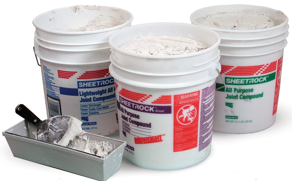
    Joint compound, also known as drywall compound or mud, is a versatile product used for finishing drywall seams and covering joints. It is made from gypsum powder, binders, and water, creating a paste-like substance. Joint compound comes in different forms, including pre-mixed or powdered varieties.

    Characteristics and Uses:

    • Joint compound has a thicker consistency compared to spackle, allowing it to be spread over larger areas.
    • It has a longer drying time, often requiring 24 hours or more, depending on the thickness of the application.
    • Joint compound is ideal for taping and finishing drywall seams, embedding joint tape, and creating a smooth surface for painting or wallpapering.
    • It is suitable for interior applications and can withstand changes in humidity and temperature.
    • Joint compound is available in different types, such as all-purpose, lightweight, and setting compounds, each with specific drying times and properties.

    Best Practices:

    • Prepare the joint compound by mixing it according to the manufacturer’s instructions if using a powdered form.
    • Apply joint compound using a trowel, covering the joint or seam evenly.
    • Embed joint tape into the wet compound for reinforcing seams, pressing it gently to remove air bubbles.
    • Allow the joint compound to dry completely, ensuring it is firm to the touch.
    • Sand the dried compound to create a smooth and seamless finish, removing any ridges or imperfections.
    • Prime and paint or apply wallpaper over the finished joint compound surface.

    Conclusion:

    In the debate between spackle vs joint compound, it is important to understand their respective characteristics and best uses. Spackle is ideal for minor repairs, filling small holes, and surface imperfections, while joint compound excels in taping and finishing drywall seams. By choosing the right product for each task, you can achieve professional-looking results and ensure the longevity of your wall repairs or renovations.

  • Shoji White: The Timeless Simplicity of Subtle Elegance

    Shoji White: The Timeless Simplicity of Subtle Elegance

    Introduction:

    In the world of interior design, finding the perfect white paint color that strikes the right balance between warmth and crispness can be a challenging task. Shoji White, with its timeless simplicity and understated elegance, has emerged as a popular choice for those seeking a versatile and sophisticated neutral hue. Inspired by the traditional Japanese shoji screens, Shoji White brings a sense of tranquility, serenity, and balance to any space. In this exploration, we delve into the characteristics, applications, and enduring appeal of Shoji White.

    A Subtle and Versatile Neutral:

    Shoji White is a soft and delicate white paint color that exudes a sense of calm and serenity. It possesses a balanced undertone that falls between warm and cool, making it a highly versatile choice for a wide range of design styles. The subtle elegance of Shoji White allows it to adapt seamlessly to both modern and traditional interiors, making it a go-to option for designers and homeowners alike.

    Timeless Simplicity:

    One of the defining characteristics of Shoji White is its timeless simplicity. Inspired by the traditional Japanese shoji screens, this color embraces the concept of minimalism and balance. Shoji White provides a clean and uncluttered look, allowing other design elements to shine. Its understated elegance ensures that it remains a classic choice that transcends passing trends and maintains its relevance over time.

    Creating a Bright and Airy Space:

    Shoji White has the power to transform a room, creating a sense of brightness and airiness. Its crisp and clean appearance reflects natural and artificial light, making a space feel open and inviting. Whether used on walls, ceilings, or trim, Shoji White enhances the overall luminosity of a room, giving it a fresh and expansive feel. It is an ideal choice for smaller spaces or rooms with limited natural light, as it helps to maximize the perception of space.

    Harmonizing with Various Design Elements:

    Shoji White’s neutral nature allows it to harmonize effortlessly with a wide range of design elements and color palettes. It serves as a versatile backdrop for both bold and subtle accents. Whether paired with vibrant hues or softer pastels, Shoji White creates a sense of balance and cohesion within the space. It allows other colors and textures to stand out, while providing a calm and cohesive visual foundation.

    The Perfect Canvas for Art and Furnishings:

    As a neutral backdrop, Shoji White acts as the perfect canvas for showcasing artwork, furnishings, and decorative accents. It allows the beauty and craftsmanship of these elements to take center stage. Whether it’s a vibrant painting, a statement piece of furniture, or a collection of treasured objects, Shoji White provides a backdrop that enhances and highlights their presence, allowing them to truly shine.

    Timeless Appeal:

    Shoji White embodies a timeless appeal that transcends passing trends. Its simplicity and elegance make it a versatile choice that can be used in a variety of settings. From modern and contemporary to traditional and transitional, Shoji White brings a sense of harmony and serenity to any space. It provides a neutral foundation that allows for flexibility in design and creates a timeless aesthetic that withstands the test of time.

    Aesthetic Versatility:

    Shoji White’s versatility extends beyond its use on walls. It can be applied to various architectural elements, such as trim, molding, and cabinetry, to create a cohesive and sophisticated look throughout the room. When used on these features, Shoji White adds depth, dimension, and a touch of refinement, further enhancing the overall aesthetic of the space.

    Conclusion:

    Shoji White, with its timeless simplicity and understated elegance, has become a sought-after choice in interior design. Its ability to create a bright and

  • Sea Salt Sherwin Williams: Tranquility and Serenity Inspired by the Ocean

    Sea Salt Sherwin Williams: Tranquility and Serenity Inspired by the Ocean

    Introduction:

    When it comes to selecting the perfect paint color, finding a shade that brings a sense of calm and serenity to a space is often a top priority. Sea Salt Sherwin Williams has quickly gained popularity as a go-to choice for creating a tranquil and soothing atmosphere. With its delicate balance of blue and green undertones, Sea Salt captures the essence of the ocean, evoking a sense of serenity and relaxation. In this exploration, we delve into the characteristics, applications, and design potential of Sea Salt Sherwin Williams.

    The Allure of Coastal Beauty:

    Sea Salt’s unique blend of blue and green undertones instantly transports us to the coastal regions, where the sky meets the sea. The color’s soothing and serene qualities reflect the natural beauty and tranquility of the ocean, making it a popular choice for those seeking a coastal-inspired ambiance within their living spaces.

    A Subtle and Versatile Hue:

    Sea Salt’s subtle and versatile nature allows it to adapt to a wide range of design styles, from modern to traditional. It serves as an excellent backdrop for creating spaces that exude a sense of calm and sophistication. Whether used in bedrooms, bathrooms, or living areas, Sea Salt adds a touch of elegance and tranquility to any room.

    Creating a Light and Airy Atmosphere:

    One of the standout features of Sea Salt is its ability to create a light and airy atmosphere within a space. The delicate blue-green undertones reflect natural and artificial light, infusing the room with a gentle luminosity. This quality is particularly beneficial for rooms with limited natural light or smaller spaces, as Sea Salt helps to open up the room, giving it a more expansive and inviting feel.

    Harmonizing with a Coastal Palette:

    Sea Salt effortlessly complements a coastal-inspired color palette. It pairs beautifully with sandy beige tones, soft whites, and ocean-inspired blues, creating a cohesive and harmonious coastal aesthetic. This versatility allows for the integration of coastal decor elements, such as weathered wood, natural textures, and nautical accents, bringing the essence of the seaside into the interior space.

    Enhancing Natural Elements:

    Sea Salt’s ability to enhance natural elements makes it a popular choice for those seeking to create a connection with the outdoors. It beautifully complements wood finishes, whether in furniture or flooring, enhancing the warmth and organic feel of the space. By bringing the serene tones of the ocean indoors, Sea Salt allows for a seamless transition between indoor and outdoor elements.

    Versatility in Different Lighting Conditions:

    Sea Salt exhibits a chameleon-like quality, shifting its appearance depending on the lighting conditions. In natural daylight, it takes on a softer and more subdued tone, creating a peaceful and calming atmosphere. Under artificial lighting, it may appear slightly more vibrant, adding a touch of energy and freshness to the space. This adaptability allows Sea Salt to transform and evolve with the changing moods and lighting throughout the day.

    Pairing with Soft Neutrals and Pastels:

    Sea Salt harmonizes beautifully with soft neutrals and pastel hues, creating a tranquil and cohesive color scheme. It complements shades of creamy whites, soft grays, and pale pinks, adding depth and dimension to the overall design. This versatility allows for the creation of spaces that feel light, airy, and effortlessly serene.

    Conclusion:

    Sea Salt Sherwin Williams, with its soothing blue-green undertones and coastal-inspired charm, has become a favored choice for creating a tranquil and serene ambiance within interior spaces. Its ability to infuse a room with a sense of tranquility, its versatility in design, and its seamless integration with coastal palettes and natural elements make it a highly desirable option for those seeking a calming oasis within their homes. Sea Salt by

  • Agreeable Gray by Sherwin Williams: The Perfect Balance of Warmth and Neutrality

    Agreeable Gray by Sherwin Williams: The Perfect Balance of Warmth and Neutrality

    Introduction:

    In the realm of interior design, finding the perfect gray paint color can be a daunting task. However, Agreeable Gray by Sherwin Williams has emerged as a popular choice for those seeking a versatile and balanced neutral hue. With its unique blend of warmth and neutrality, Agreeable Gray has gained widespread recognition for its ability to transform any space into a harmonious and inviting environment. In this exploration, we delve into the characteristics, applications, and design potential of Agreeable Gray Sherwin Williams.

    A Balanced and Versatile Neutral:

    Agreeable Gray strikes the perfect balance between warm and cool tones, making it a highly versatile neutral color. It falls into the greige category, combining gray and beige undertones, resulting in a hue that is neither too cold nor too warm. This perfect equilibrium allows Agreeable Gray to adapt seamlessly to various design styles, from modern to traditional, making it a go-to choice for designers and homeowners alike.

    An Inviting and Warm Atmosphere:

    One of the standout features of Agreeable Gray is its ability to create a cozy and welcoming atmosphere. Unlike some cooler grays that may feel sterile or stark, Agreeable Gray has a subtle warmth that adds a sense of comfort and serenity to a space. Whether used in living rooms, bedrooms, or dining areas, Agreeable Gray envelops the room in a soothing embrace, making it an ideal backdrop for relaxation and social gatherings.

    Versatility in Design:

    Agreeable Gray is highly versatile and adaptable, allowing it to complement a wide range of design elements and color palettes. Its neutral nature serves as a perfect canvas for both bold and subtle accents. Whether paired with vibrant pops of color or softer pastels, Agreeable Gray harmonizes effortlessly, creating a cohesive and visually pleasing aesthetic.

    Creating the Illusion of Space:

    Another advantage of Agreeable Gray is its ability to visually expand a room. Its light and airy undertones reflect natural and artificial light, helping to create the illusion of a larger space. This makes Agreeable Gray an excellent choice for smaller rooms or areas with limited natural light, as it enhances brightness and creates an open and inviting atmosphere.

    Harmonizing with Various Design Styles:

    Agreeable Gray’s adaptability extends to its compatibility with various design styles. It effortlessly enhances both modern and traditional aesthetics. In contemporary spaces, it provides a sleek and sophisticated backdrop for clean lines and minimalist decor. In contrast, it adds warmth and timelessness to more traditional or transitional interiors, complementing architectural details and classic furnishings.

    Seamless Integration with Different Materials:

    Agreeable Gray’s neutrality allows it to seamlessly integrate with a variety of materials and finishes. It pairs beautifully with both warm and cool wood tones, creating a harmonious balance. Additionally, it complements various metal finishes, such as brushed nickel or brass, adding an element of sophistication. From natural stone to sleek glass, Agreeable Gray acts as a unifying force, creating cohesion and flow within a space.

    Ease of Coordination:

    One of the notable strengths of Agreeable Gray is its ease of coordination with other colors and patterns. Whether used as the main wall color or as an accent, it complements a wide range of furnishings, fabrics, and artwork. This versatility simplifies the design process, allowing for seamless coordination and effortless blending of different elements.

    Conclusion:

    Agreeable Gray Sherwin Williams, with its perfect blend of warmth and neutrality, has become a go-to choice for those seeking a versatile and balanced gray paint color. Its ability to create a warm and inviting atmosphere, its versatility in design, and its seamless integration with various materials and styles make it a highly desirable option for interior spaces. Agreeable Gray provides a timeless and harmon

  • Swiss Coffee Paint: The Subtle Sophistication of a Timeless Neutral

    Swiss Coffee Paint: The Subtle Sophistication of a Timeless Neutral

    Introduction:

    In the realm of interior design, selecting the right paint color is a crucial step in setting the tone and atmosphere of a space. Swiss Coffee paint, with its delicate and versatile nature, has emerged as a popular choice for creating a timeless and sophisticated backdrop. This subtle neutral hue offers a touch of warmth, elegance, and versatility, making it a go-to option for designers and homeowners alike. In this exploration, we delve into the characteristics, applications, and enduring appeal of Swiss Coffee paint.

    A Soft and Delicate Neutral:

    Swiss Coffee paint is a warm and creamy off-white color that exudes a sense of tranquility and serenity. Unlike cooler shades of white, Swiss Coffee possesses a subtle undertone that adds depth and warmth to a space. It strikes a balance between a crisp white and a soft beige, making it a versatile option for a wide range of design styles.

    Versatility in Design:

    One of the key strengths of Swiss Coffee paint is its versatility. It serves as an excellent backdrop for a variety of interior design styles, from modern and minimalist to traditional and rustic. The soft and understated nature of Swiss Coffee allows it to blend seamlessly with different color palettes and materials, providing a neutral foundation that allows other design elements to shine.

    Creating Light and Airy Spaces:

    Swiss Coffee paint has the power to transform a room, creating an atmosphere of lightness and airiness. Its warm undertones reflect light in a soft and gentle manner, making a space feel open and inviting. Whether used on walls, ceilings, or trim, Swiss Coffee paint brings a luminous quality to a room, amplifying natural light and creating a sense of spaciousness.

    Enhancing Architectural Details:

    Swiss Coffee paint is an ideal choice for highlighting and enhancing architectural features within a space. When applied to trim, molding, or doors, it provides a subtle contrast against walls, adding depth and visual interest. Swiss Coffee paint allows these details to stand out, creating a sense of craftsmanship and elegance that elevates the overall aesthetic.

    Harmonizing with Various Color Schemes:

    One of the advantages of Swiss Coffee paint is its ability to harmonize with a wide range of color palettes. It pairs beautifully with both warm and cool tones, allowing for endless possibilities when creating a cohesive color scheme. Whether combined with soft pastels, vibrant jewel tones, or earthy neutrals, Swiss Coffee paint serves as a versatile backdrop that enhances the overall visual impact of a room.

    Timeless Elegance:

    Swiss Coffee paint embodies a timeless elegance that transcends passing trends. Its neutral and refined quality adds a touch of sophistication to any space without overpowering other design elements. Swiss Coffee provides a clean and classic look that remains fresh and relevant over time, ensuring that the aesthetic appeal of a room endures for years to come.

    Low-Maintenance and Durability:

    Aside from its aesthetic appeal, Swiss Coffee paint offers practical advantages as well. It is known for its durability and low-maintenance properties, making it a reliable choice for high-traffic areas. Swiss Coffee paint resists stains and is easy to clean, allowing for long-lasting beauty and functionality in busy households or commercial spaces.

    Conclusion:

    Swiss Coffee paint, with its soft and delicate nature, serves as a timeless and versatile option in interior design. Its ability to create light and airy spaces, enhance architectural details, and harmonize with various color schemes ensures its enduring appeal. Whether used in modern or traditional settings, Swiss Coffee paint brings a sense of tranquility, sophistication, and warmth to a room. As a neutral backdrop that complements other design elements, Swiss Coffee paint continues to be a trusted choice for creating an elegant and timeless aesthetic in homes and commercial spaces alike

  • The Timeless Charm of Black and White Tile: A Classic Duo that Transcends Trends

    The Timeless Charm of Black and White Tile: A Classic Duo that Transcends Trends

    Introduction:

    In the world of interior design, certain elements stand the test of time, effortlessly blending with various styles and eras. Black and white tile, with its timeless appeal, has remained a beloved choice for flooring and wall surfaces for decades. This classic duo embodies elegance, versatility, and a touch of nostalgia, making it a design staple that transcends trends. In this exploration, we delve into the characteristics, applications, and enduring charm of black and white tile.

    A Study in Contrast:

    Black and white tile is characterized by the striking contrast created by the combination of these two opposite ends of the color spectrum. The stark juxtaposition between light and dark adds visual interest, depth, and drama to any space. This interplay of contrasts creates a dynamic and eye-catching aesthetic that has captivated designers and homeowners for generations.

    Endless Design Possibilities:

    One of the key strengths of black and white tile is its versatility. The classic color combination provides a neutral base that pairs well with a variety of design styles, from traditional to modern. The simplicity of black and white allows for endless design possibilities, whether it’s achieving a retro look, adding a touch of sophistication, or creating a contemporary, minimalist space.

    Timeless Elegance:

    Black and white tile exudes a timeless elegance that never goes out of style. The monochromatic palette is inherently chic and sophisticated, lending a sense of refinement to any room. Whether used in kitchens, bathrooms, entryways, or living areas, black and white tile elevates the overall aesthetic, creating a space that feels both timeless and effortlessly stylish.

    Classic Retro Vibes:

    Black and white tile holds a strong association with the retro aesthetic of the mid-20th century. The checkerboard pattern, in particular, brings a nostalgic charm reminiscent of vintage diners and classic Hollywood films. Embracing black and white tile in a retro-inspired space can evoke a sense of nostalgia, capturing the spirit of a bygone era while maintaining a fresh and relevant appeal.

    Designing with Patterns:

    Black and white tile opens up a world of pattern possibilities. From classic checkerboard patterns to intricate mosaics, herringbone layouts, or geometric designs, the interplay of black and white allows for the creation of captivating visual patterns. These patterns can be used to define zones, add visual interest, or even create focal points within a room, showcasing the versatility and artistry of black and white tile.

    Versatile Pairing with Colors:

    While black and white tile shines on its own, it also serves as a versatile backdrop for incorporating color into the design scheme. The neutral foundation of black and white allows for seamless integration with bold or subtle pops of color. Whether through accessories, furnishings, or accent walls, the combination of black and white tile with carefully chosen hues can bring a vibrant and personalized touch to the space.

    Long-Lasting Durability:

    Apart from its aesthetic appeal, black and white tile is known for its durability. The materials used, such as ceramic or porcelain, offer strength and resilience, making it a practical choice for high-traffic areas. With proper maintenance and care, black and white tile can withstand the test of time, ensuring its lasting beauty and functionality for years to come.

    Conclusion:

    Black and white tile, with its striking contrast, timeless elegance, and design versatility, remains a beloved choice in interior design. The classic duo’s ability to transcend trends, evoke nostalgia, and serve as a neutral canvas for various design styles and color schemes ensures its enduring charm. Whether creating a retro-inspired space or adding a touch of sophistication to a contemporary interior, black and white tile continues to captivate with its enduring beauty and design possibilities.

  • Benjamin Moore Balboa Mist: The Subtle Elegance of a Timeless Gray

    Benjamin Moore Balboa Mist: The Subtle Elegance of a Timeless Gray

    Introduction:

    In the world of interior design, finding the perfect balance between soothing neutrality and subtle sophistication can be a challenge. Benjamin Moore Balboa Mist, a timeless and versatile shade of gray, has emerged as a popular choice for creating serene and elegant spaces. With its delicate undertones and soft appearance, Balboa Mist brings a sense of tranquility and warmth to any room. In this exploration, we delve into the characteristics, applications, and design potential of Benjamin Moore Balboa Mist.

    A Delicate Shade of Gray:

    Benjamin Moore Balboa Mist is a light gray color with warm undertones. It falls within the category of greige, a blend of gray and beige, which gives it a gentle and understated presence. Unlike cooler shades of gray, Balboa Mist exudes a sense of warmth and coziness, making it an inviting choice for both residential and commercial interiors.

    Versatility in Applications:

    One of the notable strengths of Benjamin Moore Balboa Mist is its versatility. It adapts well to a variety of design styles, from modern to traditional, and can be used in various spaces throughout a home or office. Balboa Mist is an ideal choice for walls, providing a neutral and calming backdrop that allows other design elements to shine. It also complements a wide range of furniture styles and materials, making it easy to integrate into existing or evolving design schemes.

    Creating Airy and Serene Spaces:

    Balboa Mist’s subtle and airy nature makes it an excellent option for creating tranquil and serene spaces. When applied to walls, it adds a softness that enhances natural light and creates an open, airy atmosphere. This quality is particularly beneficial for smaller rooms or spaces with limited natural light, as it helps to create the illusion of a larger and brighter area.

    Pairing with Various Color Palettes:

    One of the advantages of Benjamin Moore Balboa Mist is its ability to harmonize with different color palettes. It complements both cool and warm tones, making it a versatile choice for coordinating with a variety of colors. It pairs beautifully with soft blues, pale greens, warm grays, and creamy whites, allowing for endless possibilities when it comes to creating color schemes that evoke a sense of harmony and elegance.

    Enhancing Modern and Minimalist Designs:

    Balboa Mist’s soft and understated quality lends itself well to modern and minimalist design aesthetics. When paired with clean lines, sleek furnishings, and minimal décor, it creates a sophisticated and streamlined atmosphere. Balboa Mist allows other design elements to take center stage, acting as a quiet backdrop that brings a sense of cohesion and balance to the overall space.

    Adding Warmth to Traditional and Transitional Styles:

    While Balboa Mist is well-suited for modern designs, it also complements traditional and transitional styles with ease. It can be used to create a sense of warmth and comfort in spaces with classic or vintage-inspired elements. When paired with rich wood tones, traditional furniture, and elegant accessories, Balboa Mist adds a touch of modernity while maintaining a timeless and inviting ambiance.

    Conclusion:

    Benjamin Moore Balboa Mist, with its delicate gray hue and warm undertones, offers a timeless and elegant option for interior design projects. Its versatility, ability to create airy and serene spaces, and compatibility with various design styles and color palettes make it a popular choice among designers and homeowners. Whether used to bring a sense of calm to modern spaces or to add warmth and sophistication to traditional interiors, Benjamin Moore Balboa Mist proves to be a versatile and enduring color that adds a touch of subtle elegance to any room.

  • Sherwin Williams Peppercorn: A Sophisticated Shade of Charcoal Gray

    Sherwin Williams Peppercorn: A Sophisticated Shade of Charcoal Gray

    Introduction:

    In the world of interior design, color selection plays a vital role in setting the tone and ambiance of a space. Among the myriad of choices, Sherwin Williams Peppercorn has emerged as a popular and versatile color option. This sophisticated shade of charcoal gray offers a unique blend of richness, depth, and versatility, making it a compelling choice for both modern and traditional aesthetics. In this exploration, we delve into the characteristics, applications, and design potential of Sherwin Williams Peppercorn.

    A Captivating Charcoal Gray:

    Sherwin Williams Peppercorn belongs to the family of deep charcoal grays. Unlike typical lighter shades of gray, Peppercorn exhibits a distinct depth and intensity that adds an air of sophistication to any space. It possesses a warm undertone, making it an inviting and elegant choice for interior design projects.

    Versatile Applications:

    One of the key strengths of Sherwin Williams Peppercorn is its versatility. It adapts well to a range of design styles and can be used in various spaces within a home or commercial setting. Whether it’s applied to walls, cabinetry, furniture, or even accent pieces, Peppercorn effortlessly blends with different color palettes and materials, allowing for endless design possibilities.

    Creating Drama and Contrast:

    The rich and dark nature of Sherwin Williams Peppercorn makes it an excellent choice for creating a sense of drama and contrast in a room. When used on walls, it provides a striking backdrop that allows lighter elements and furnishings to pop, creating a visually captivating space. Additionally, Peppercorn can be paired with complementary colors or contrasting hues to enhance its impact and create a dynamic aesthetic.

    Elevating Modern and Contemporary Designs:

    Peppercorn’s deep charcoal tones lend themselves particularly well to modern and contemporary design schemes. When paired with sleek metallic finishes, clean lines, and minimalist décor, it creates a refined and luxurious atmosphere. This color choice adds depth and sophistication to spaces, making it an ideal option for modern living rooms, kitchens, or home offices.

    Enhancing Traditional and Classic Styles:

    Contrary to its association with modern aesthetics, Sherwin Williams Peppercorn can also be a fantastic addition to traditional or classic interiors. When combined with vintage furniture, ornate details, and rich textures, it creates a timeless and elegant ambiance. Peppercorn can be used as an accent color in trim, molding, or built-in shelving, providing depth and contrast to traditional spaces while maintaining a sense of warmth and charm.

    Harmonizing with Various Color Palettes:

    Another advantage of Sherwin Williams Peppercorn is its ability to harmonize with a wide range of color palettes. It pairs well with both warm and cool tones, such as creamy whites, soft blues, warm grays, and earthy neutrals. This versatility allows designers and homeowners to create cohesive and visually appealing spaces, adding depth and interest to the overall design concept.

    Conclusion:

    Sherwin Williams Peppercorn, with its deep and sophisticated charcoal gray hue, offers a compelling choice for interior design projects. Its versatility, ability to create drama and contrast, and compatibility with various design styles and color palettes make it a go-to option for designers and homeowners alike. Whether used to add a touch of elegance to modern spaces or to enhance the timeless charm of traditional interiors, Sherwin Williams Peppercorn proves to be a captivating color that elevates the aesthetic appeal of any room.

  • Which Loft Ladder Is Best?

    Which Loft Ladder Is Best?

    Loft ladders can be difficult to select due to their wide variety. Choosing one depends on many factors, such as your home size and shape, how often it is used for storage or access, budget considerations, and personal preference – it is worth remembering that getting the appropriate ladder can become part of a permanent fixture! It is, therefore, crucial that the right one be selected.

    As your starting point, take the height of the ceiling in the room where your ladder will be installed into account. From there, take measurements of your loft hatch opening itself (taking care not to miss any corners) to determine how much clearance exists for a ladder installation. With these measurements in hand, look at various ladder models available and select which would make a suitable addition.

    Think carefully about safety features when purchasing your ladder. In particular, ensure it comes equipped with non-slip treads and stable platforms to withstand hauling items up and down easily and safely. In addition, the ladder should be easy to erect. It should accommodate various ceiling heights easily – and don’t forget to verify its maximum load capacity before making a purchase decision if applicable to your needs.

    An excellent investment is an adjustable loft ladder suitable for multiple ceiling heights and space conditions. They are constructed of premium-grade materials, such as those found in medical devices, such as aluminium alloy or titanium; such a ladder can hold up to 250 pounds without bowing or bending and is lightweight, making assembly and dismantling straightforward and hassle-free.

    This durable option is suitable for most homes. It has a telescoping design, making it easy to open and close, as well as double-height locking latches for extra safety and non-marring feet. Plus, the installation comes complete with its user manual!

    This metal concertina loft ladder from ALUFIX is another fantastic choice for accommodating ceiling heights with varied ceiling heights. It is insulated to prevent drafts and heat loss and is simple to clean. Furthermore, spring-assisted stowage means it takes up less space when not used.

    Installing this ladder may be possible on your own, but it is best left to someone experienced in DIY and handy with tools. Once complete, however, you’ll have a durable loft ladder that can last many years – perfect for storage needs and other tasks such as accessing loft space for functions and storage purposes. Features of the auto-locking clamp include a stabilizer bar to reduce unwanted movement when climbing, handrail, non-slip feet angle feet, and 2nd side handrail/ladder slide system, making use even more comfortable!

  • The Enigmatic Color of Indigo

    The Enigmatic Color of Indigo

    Introduction:

    Colors have the power to captivate our senses and evoke emotions. Among the vast palette of hues, one particular shade has intrigued artists, scientists, and enthusiasts for centuries — indigo. This elusive color holds a unique position in our perception, often prompting questions about its true nature. In this exploration, we delve into the origins, characteristics, and cultural significance of indigo, attempting to unravel the mystery surrounding its appearance.

    Read Also: Deck covers

    Historical Background:

    Indigo derives its name from the Greek word “indikon,” meaning “Indian.” Its journey can be traced back to ancient civilizations, where the dye obtained from the plant Indigofera tinctoria played a vital role in textile production. The process of extracting indigo dye was complex and required skilled craftsmanship. It involved fermenting the leaves of the indigo plant, resulting in a vibrant blue dye that held immense value and was traded across continents.

    The Color of Indigo:

    Indigo resides between blue and violet in the visible spectrum, possessing a rich, deep hue. While many assume indigo to be a shade of blue, others argue that it leans closer to violet due to its purple undertones. The perception of indigo can vary from person to person, leading to debates and different interpretations.

    Scientific Interpretation:

    From a scientific standpoint, color perception is subjective, and distinguishing between blue and violet hues can be challenging for individuals. Some scientists propose that indigo is not a distinct color but rather a variation of blue or violet. They suggest that the division of the color spectrum into seven distinct colors, including indigo, can be attributed to Sir Isaac Newton’s influence in his study of optics. Nevertheless, the perception of indigo as a separate color persists in various cultures and artistic disciplines.

    Cultural Significance:

    Indigo has had a profound impact on cultures worldwide, playing a significant role in art, fashion, and symbolism. In ancient civilizations like Egypt, indigo was associated with spirituality and was utilized in religious ceremonies. In Japan, the dyeing technique known as “aizome” involved using indigo to color traditional garments such as kimonos, representing purity and protection against evil spirits. In Western culture, indigo is often associated with intuition, mysticism, and deep introspection.

    Artistic Expression:

    Artists have been inspired by indigo’s enigmatic allure throughout history. Renowned painters like Vincent van Gogh and Claude Monet skillfully employed indigo pigments in their masterpieces, capturing the essence of night skies and shadowy depths. The distinct quality of indigo allowed artists to convey a sense of mystery and depth in their works, elevating the emotional impact on the viewer.

    Contemporary Use:

    In modern times, indigo continues to hold cultural and artistic significance. It finds applications in various fields, such as fashion, interior design, and graphic arts. The versatility of indigo allows it to evoke a range of emotions, from tranquility and serenity to intensity and depth. Its use in branding and advertising often conveys a sense of sophistication, authenticity, and individuality.

    Conclusion:

    Indigo, with its rich history and complex nature, remains a captivating color that defies easy categorization. Whether perceived as a shade of blue or a variant of violet, indigo continues to spark curiosity and intrigue. Its role in ancient traditions, artistic expression, and contemporary culture ensures its enduring presence in our lives. As we explore the world of colors, indigo serves as a reminder of the beauty and complexity that reside within the spectrum of human perception.

  • Alabaster Sherwin Williams: The Timeless Beauty of a White Classic

    Alabaster Sherwin Williams: The Timeless Beauty of a White Classic

    Introduction:

    When it comes to selecting a white paint color that exudes elegance and timelessness, Alabaster by Sherwin Williams stands out as a classic choice. This article explores the characteristics, applications, and enduring appeal of Alabaster, showcasing why it has become a favored white among homeowners and designers seeking a versatile and sophisticated backdrop for their spaces.

    The Allure of Alabaster:

    Sherwin Williams Alabaster is a soft and warm white with subtle undertones that create a sense of tranquility and refinement. Unlike stark or cool whites, Alabaster radiates warmth and depth, adding character and charm to any room. Its creamy undertones lend a welcoming and serene ambiance, making it a highly sought-after white paint color.

    Versatility in Design:

    One of the key attributes of Alabaster is its versatility. This shade effortlessly adapts to various design styles, seamlessly complementing both traditional and contemporary aesthetics. Alabaster serves as a blank canvas, providing a backdrop that allows other design elements, such as furniture, artwork, or architectural features, to shine. Whether used on walls, ceilings, trim, or cabinetry, Alabaster creates a harmonious and versatile color scheme throughout a space.

    Creating a Bright and Airy Atmosphere:

    Alabaster’s soft and warm undertones contribute to creating a light and airy atmosphere in any room. It reflects natural and artificial light beautifully, enhancing the brightness of a space while maintaining a serene and calming ambiance. Whether utilized in smaller rooms or spaces with limited natural light, Alabaster has the ability to make them feel more spacious and open.

    Pairing with Other Colors:

    Alabaster’s neutral qualities allow it to harmonize effortlessly with a wide range of colors. It pairs elegantly with soft pastels, such as blush pink or light blue, creating a delicate and serene atmosphere. For those seeking a bolder statement, Alabaster can be combined with vibrant jewel tones like emerald green or sapphire blue, creating a striking contrast against the white backdrop. Additionally, natural materials and textures, such as wood or woven elements, harmonize beautifully with Alabaster, enhancing its organic and inviting feel.

    Highlighting Architectural Features:

    Alabaster can be used to accentuate architectural details and moldings within a space. When applied to trim, doors, or crown moldings, it adds a touch of sophistication and refinement, emphasizing the intricate craftsmanship and architectural features of a room. Its soft and warm undertones draw attention to these elements, enhancing the overall aesthetic and creating a cohesive and elegant look.

    A Timeless and Sophisticated Aesthetic:

    Alabaster’s timeless and sophisticated aesthetic has made it a popular choice among homeowners and designers alike. Whether used in a traditional setting or combined with contemporary elements, Alabaster exudes a sense of elegance and refinement. It transcends passing design trends, ensuring its longevity and appeal for years to come.

    Conclusion:

    Sherwin Williams Alabaster is a versatile and enduring white paint color that brings a sense of tranquility and sophistication to any space. Its soft and warm undertones, coupled with its timeless appeal, make it a favored choice for homeowners and designers seeking a classic and versatile backdrop. Whether used as the main color or as a complementary hue, Alabaster enhances the aesthetics of a room while providing a serene and cohesive atmosphere. With its ability to adapt seamlessly to various design styles and its enduring elegance, Alabaster continues to captivate those in search of a white classic that stands the test of time.